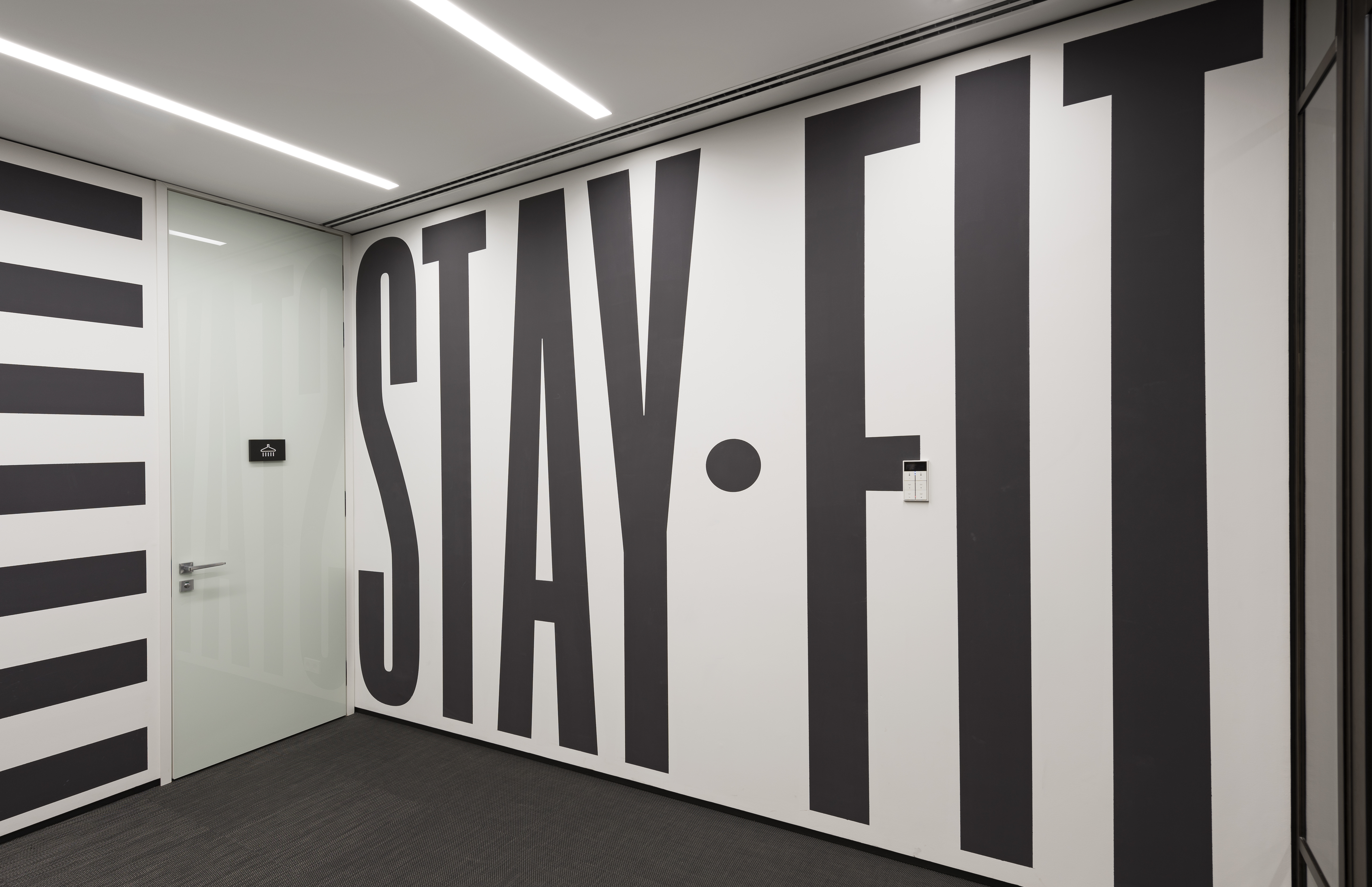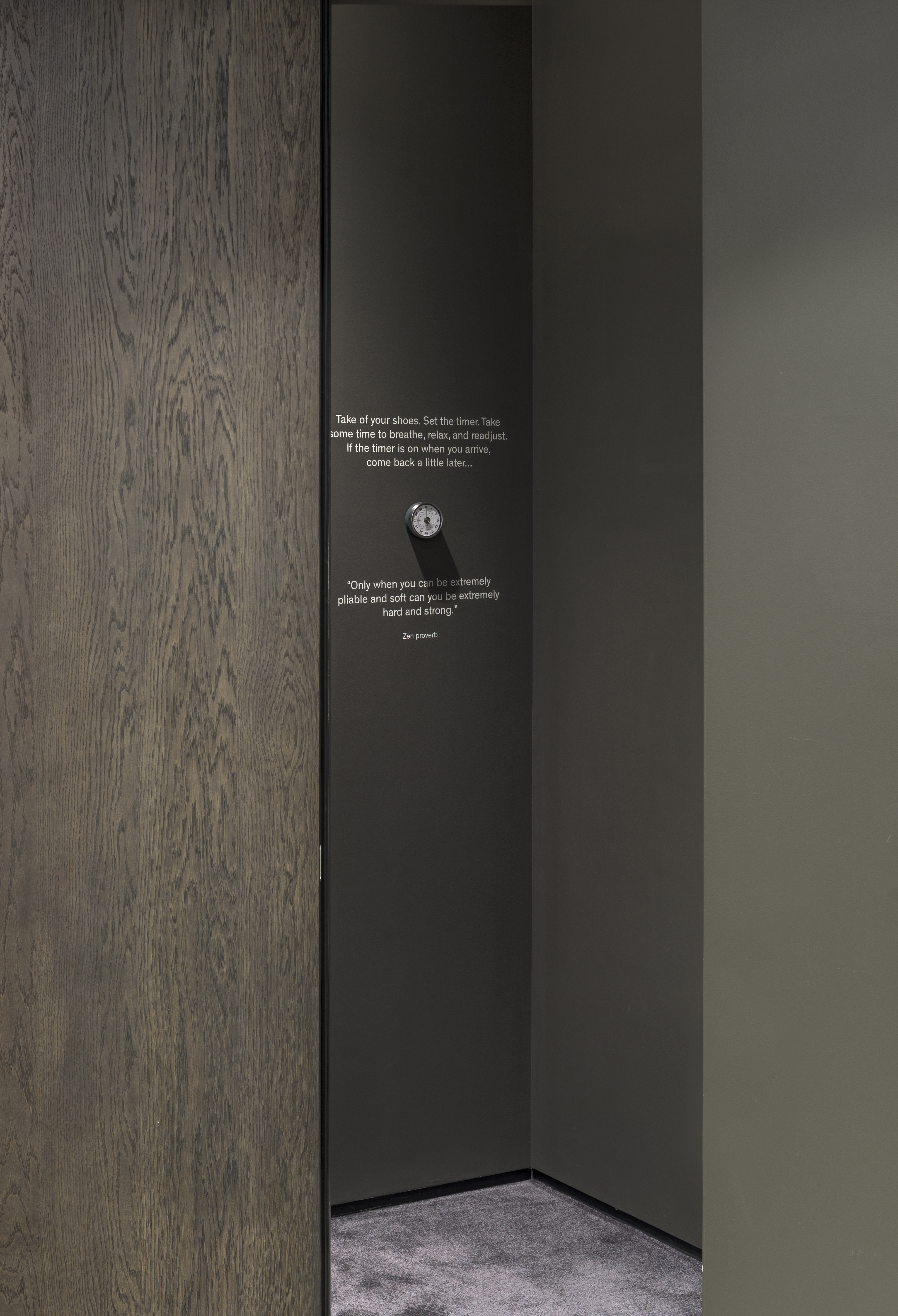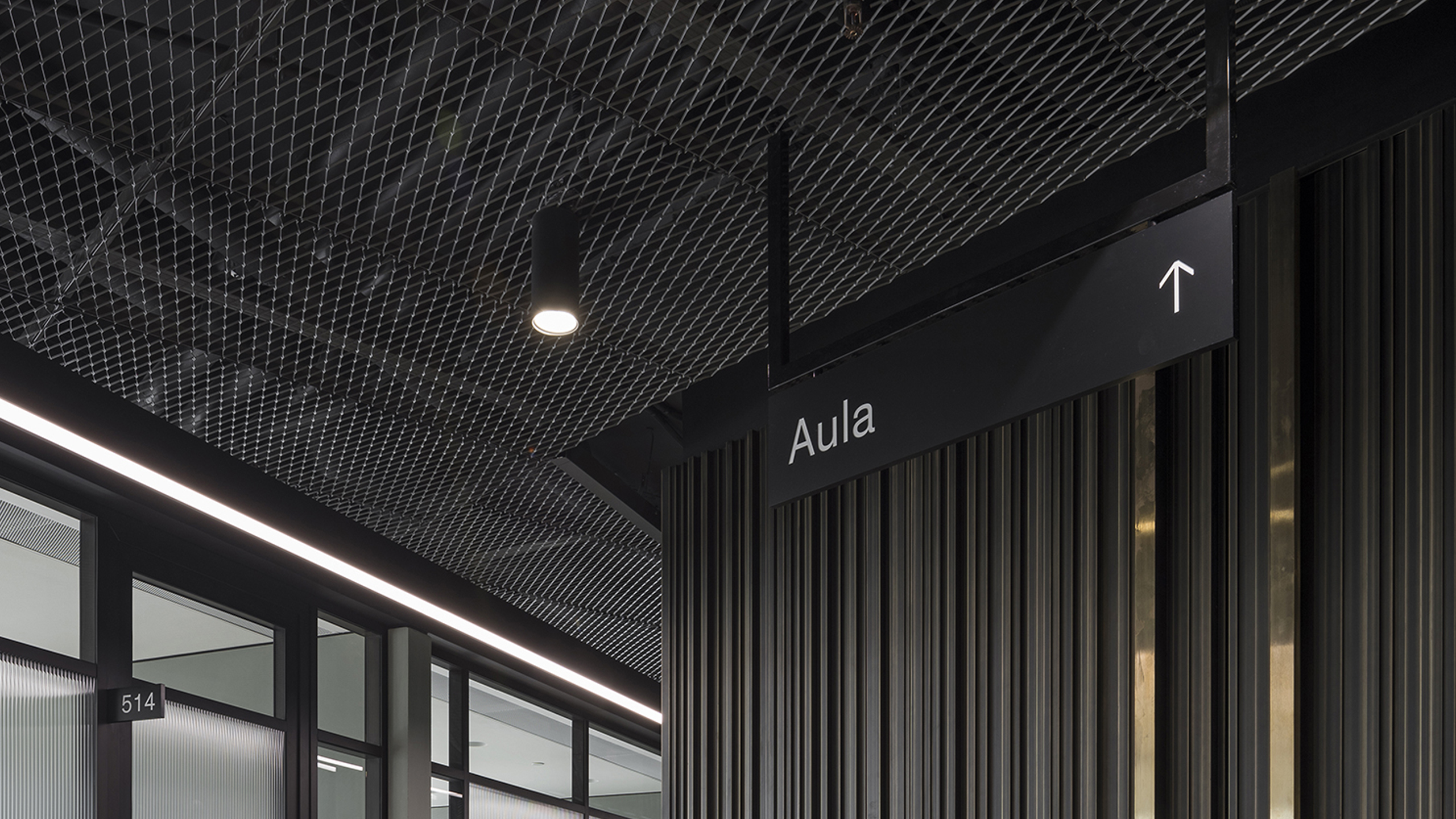
Navigation and form language in office interior
The task of the new space was to reflect the spirit of the country, preserving the individuality of the Company, its value orientations. This perception has become the basis for developing the design concept for the new office. At the center of the Company’s philosophy are bright, obsessive and talented people, so the starting point for designing a new space was the three great Russian figures of the 20th century who professed the values closest to the Company: Anna Akhmatova, Dmi- try Shostakovich and Andrei Tarkovsky.
Yuri Shostakovich did not see his life without work. The rhythm of his music can be caught in the interior, the alternation of dark and light office areas are similar to parts of one big symphony - with sonatas, minuets, pauses. Andrei Tarkovsky is a famous perfectionist. It is known that he repainted the grass on the territory of the shooting of “Stalker” in order to achieve the desired shade of green. The ideology of the Tarkovsky perfectionist in the interior is reflected through the laconic use of color in the interior - mostly green oases in the interior and colored surfaces in the open space. Anna Akhmatova symbolizes the fragility, transparency in the project. Thin and ringing poetry, always dedicated to specific people and events, was re- flected in the transparent “honesty” of architectural decisions
—
Role: Graphic design concept, navigation and diverse other graphic design projects Performed in ARCH(E)TYPE in collaboration with Fedor Velyaminov
—
Role: Graphic design concept, navigation and diverse other graphic design projects Performed in ARCH(E)TYPE in collaboration with Fedor Velyaminov