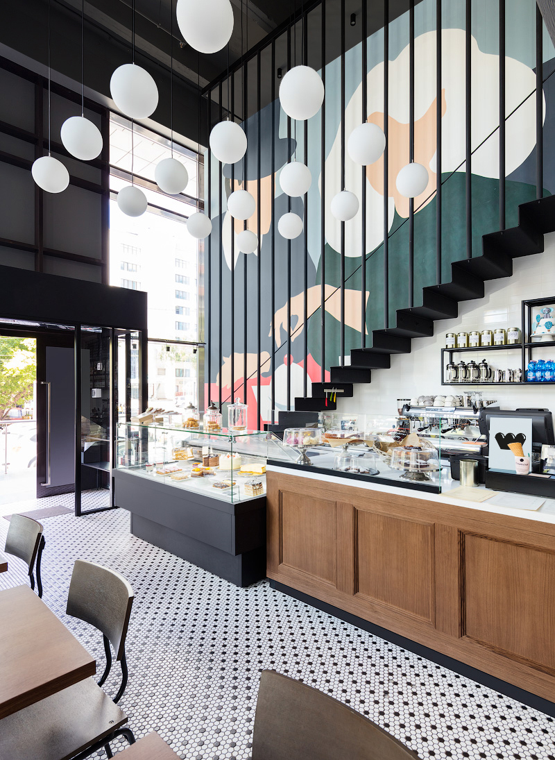
The wall drawing of the interieur functions as the main ingredient for the overall style and branding components
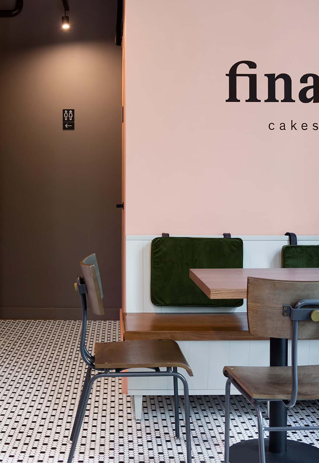
The color solution of the fresco is correlated with the cafe products and the leading shades in the interior: pastel colors intersect with more contrasting, dark and deep, supporting the cozy and light atmosphere of the main hall.
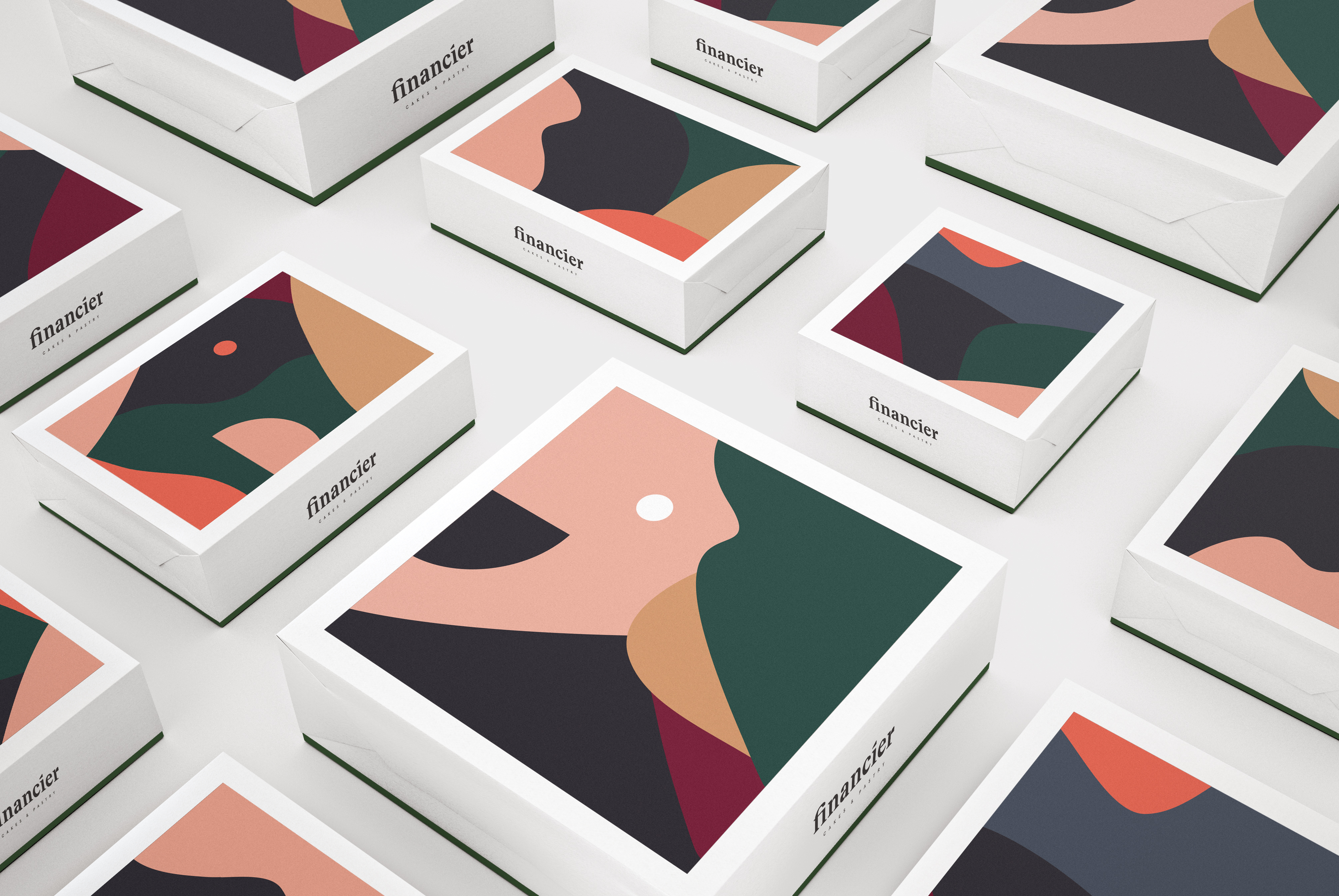
Corporate identity continues this leitmotif of color combinations, moving into more abstract forms, but remaining recognizable. The prominent wall drawing of the interieur functions as the main ingredient for the overall style and branding components.
Like the selected ingredients that determine the destinctive flavors in financier products, the mural determines the outcome of the identity elements.
Performed in ARCH(E)TYPE. In colaboration with Fedor Velyaminov . Role: graphic design concept, developing design.
Like the selected ingredients that determine the destinctive flavors in financier products, the mural determines the outcome of the identity elements.
Performed in ARCH(E)TYPE. In colaboration with Fedor Velyaminov . Role: graphic design concept, developing design.


