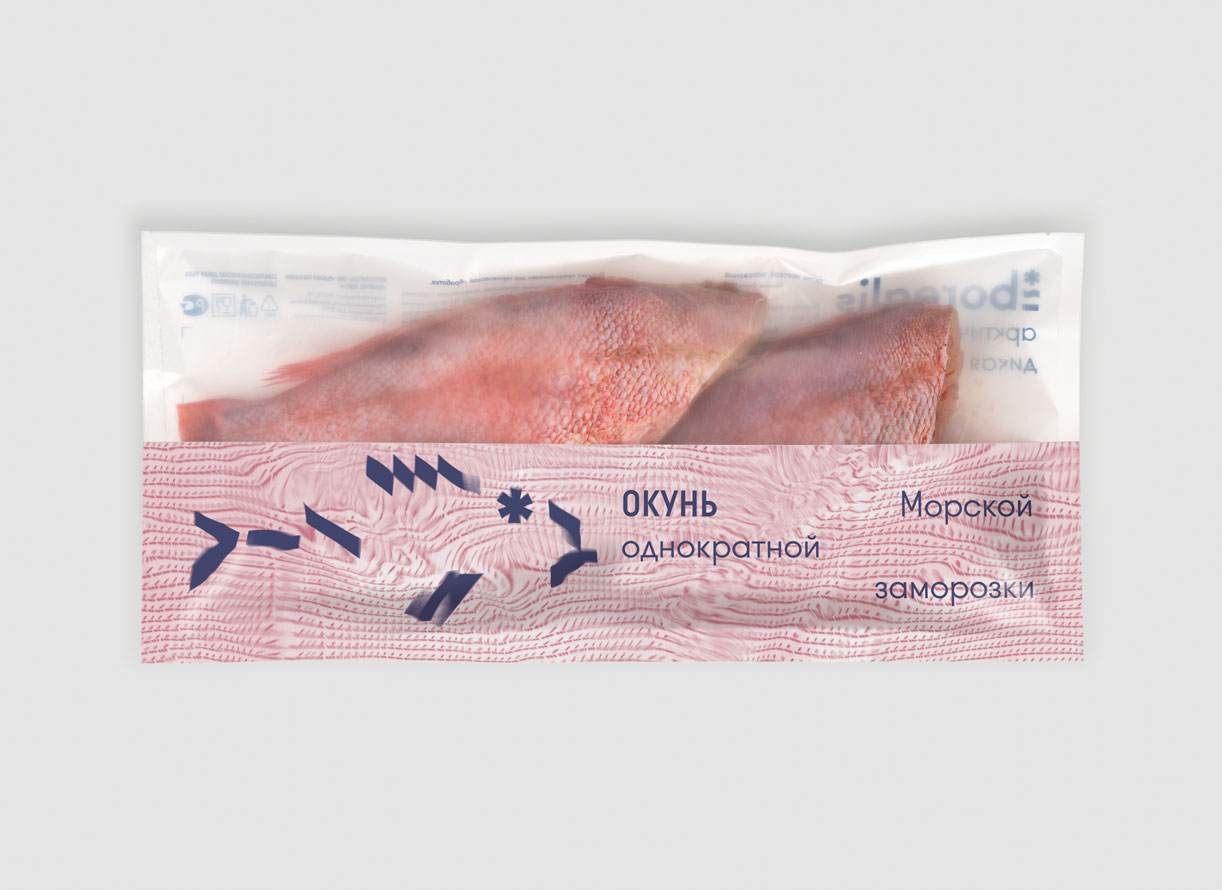
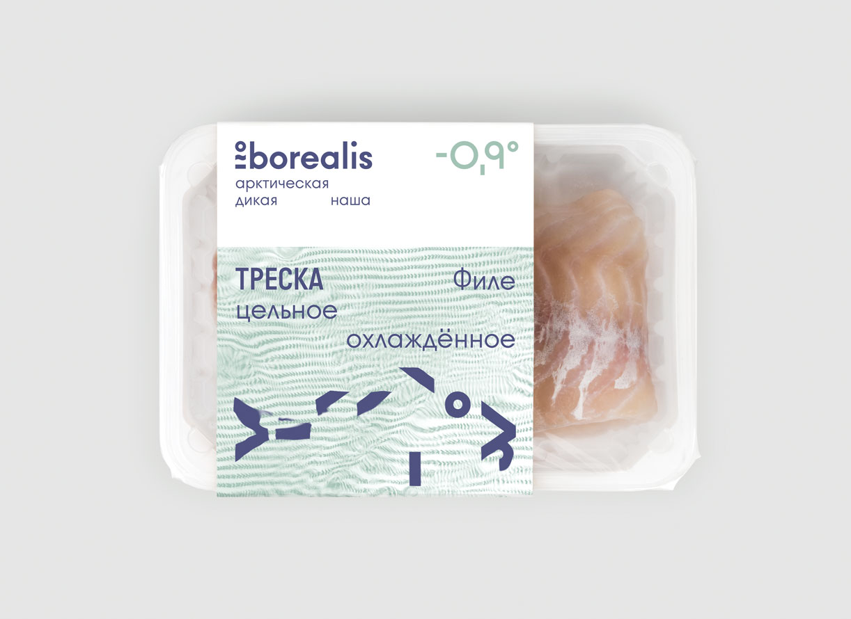
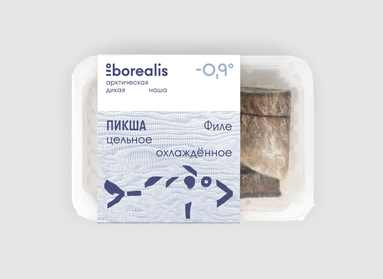
Borealis
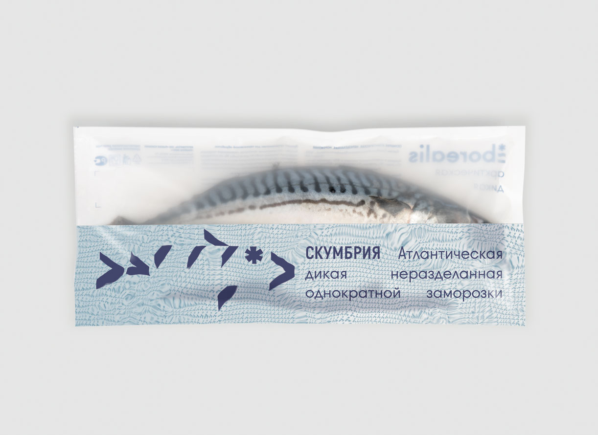
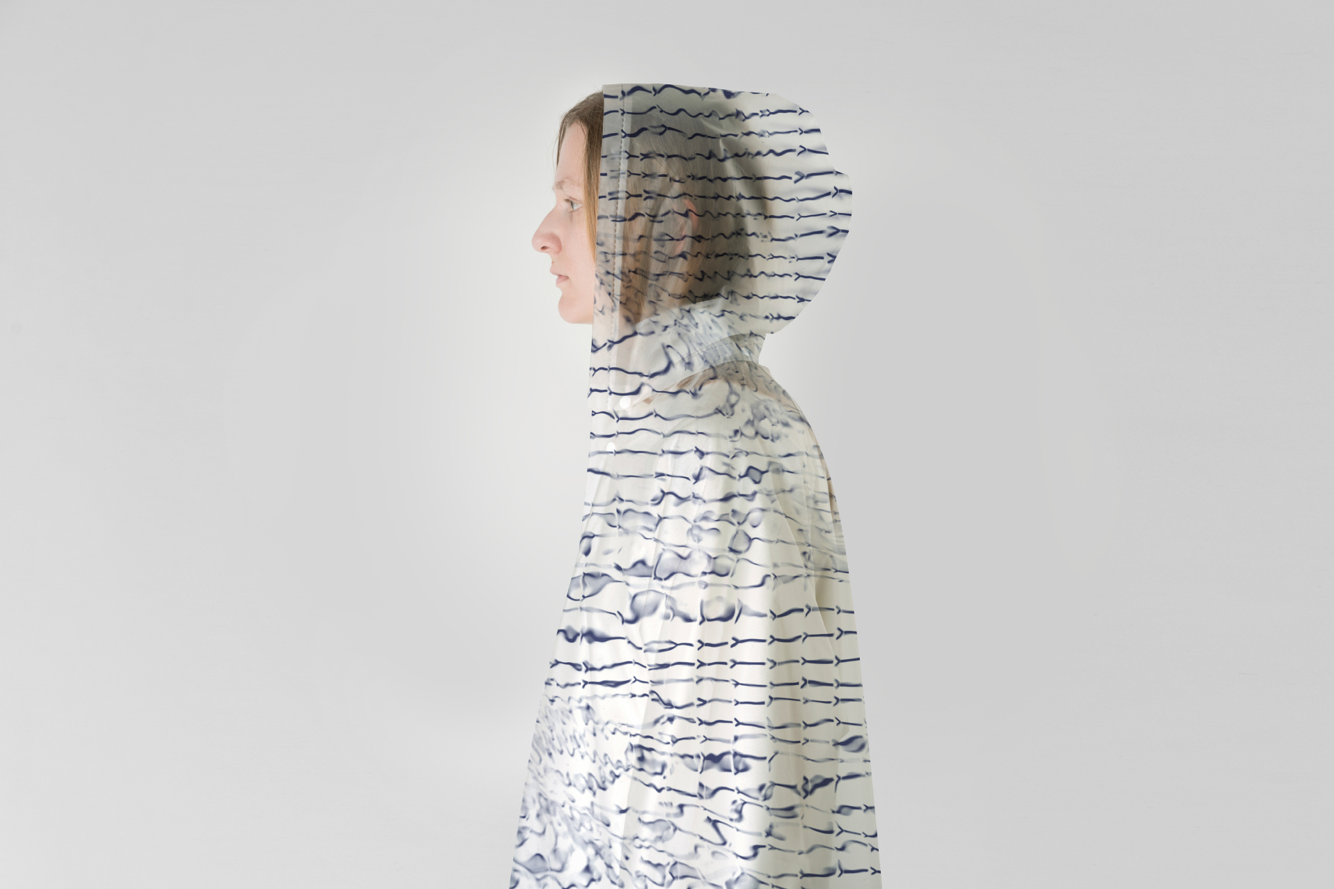
Wild fish from Northern See with graphics and patterns created by water
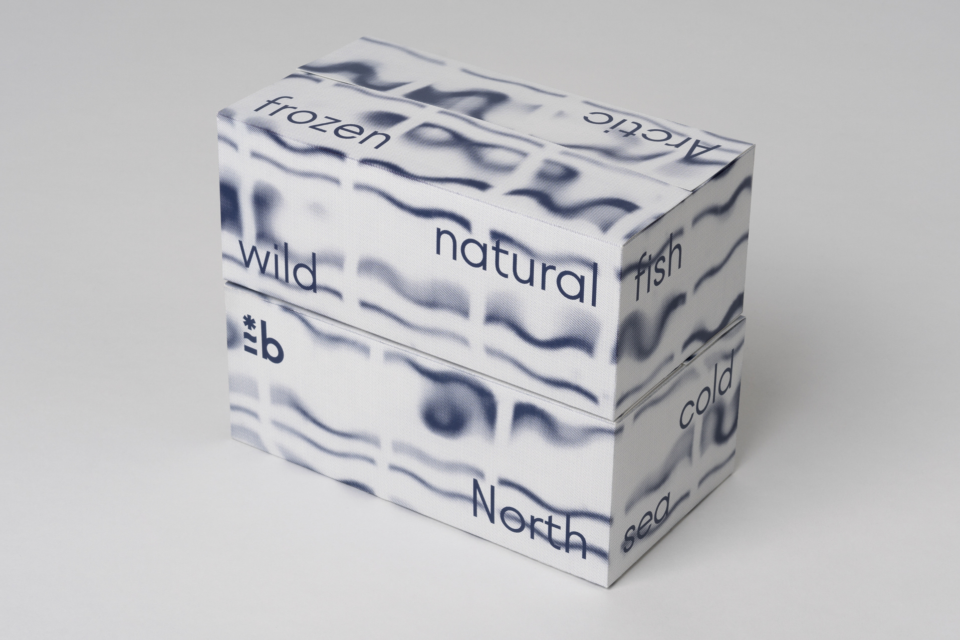
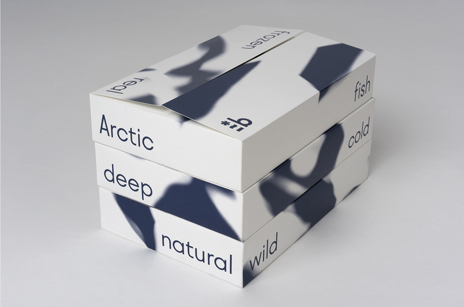
Borealis (from Latin: northern, cold) is a leading fishing company in Russia that owns a trawl fleet to fish in Nothen sea. The core of identity was to reflect the wild, northern and deep-sea fish. The product line includes 9 types of fish where each of them has its own unique features.
A personal logo for all fish species based on research about recognizable visual aspects and the behavior of each species. Together with an original typeface with alternative letters connectecd to their individual features and visual recognizable elements.
Experimental approach
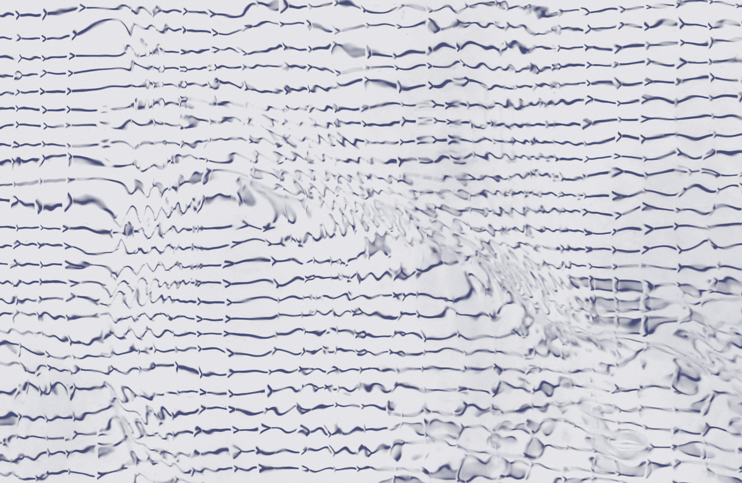
By placeing the signs and graphics under the sea water, nature have helped to make the design alive and to show that fish is really wild. It gives a variety of abstract graphics and patterns, which everyone can find their own association. The fish sign becomes alive and graphics start to look like the sea element, wild nature, aurora borealis, fish skin, ice, waves and so on.
Performed in Ermoleav Bureau. Role: Developing and responsible for pattern concept and design, participation to the concept and design in general and technical work.
Experimental approach
By placeing the signs and graphics under the sea water, nature have helped to make the design alive and to show that fish is really wild. It gives a variety of abstract graphics and patterns, which everyone can find their own association. The fish sign becomes alive and graphics start to look like the sea element, wild nature, aurora borealis, fish skin, ice, waves and so on.
Performed in Ermoleav Bureau. Role: Developing and responsible for pattern concept and design, participation to the concept and design in general and technical work.

 Picture by Ermoleav Bureau.
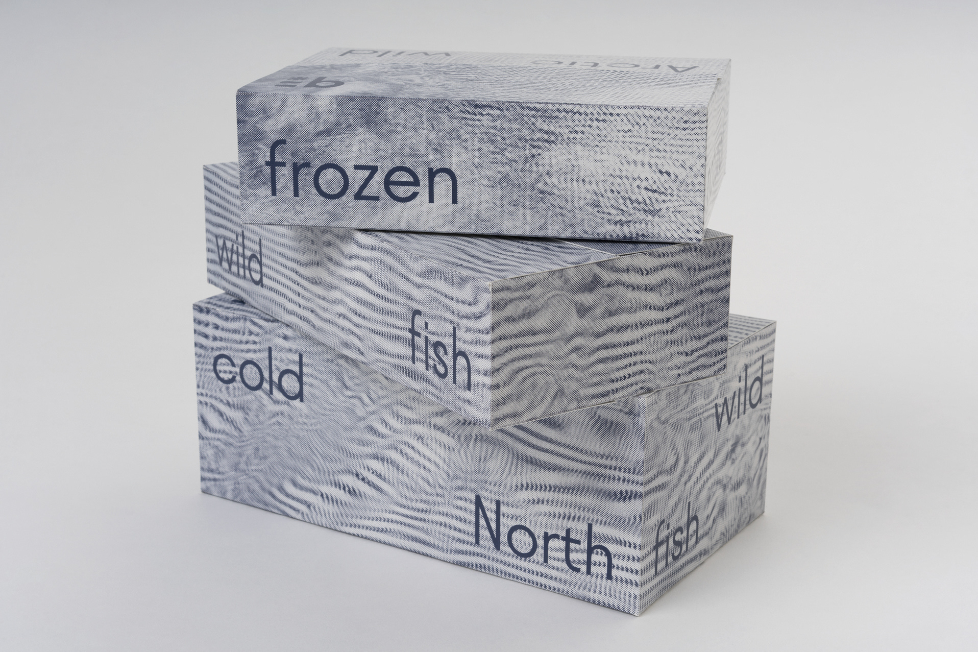
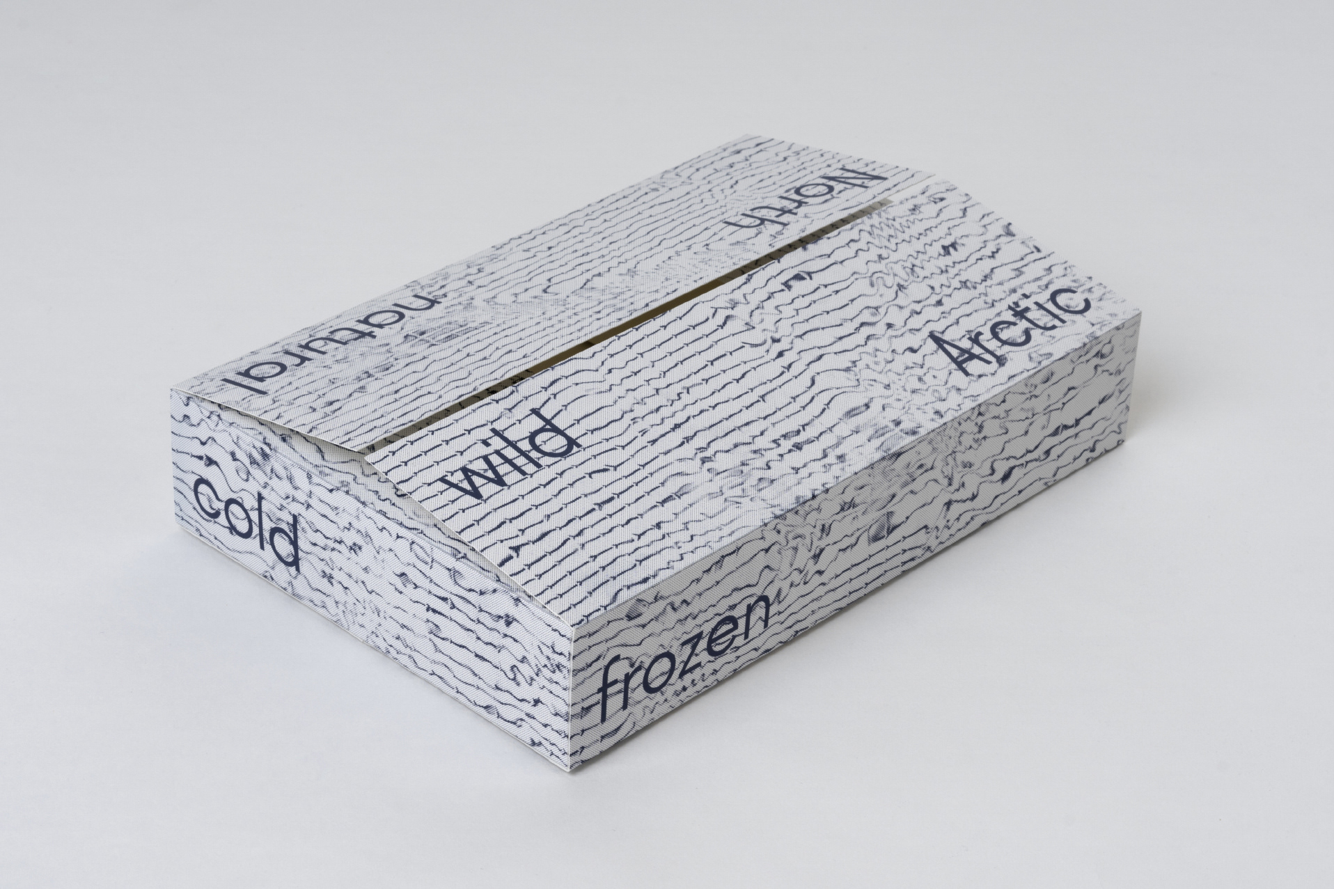
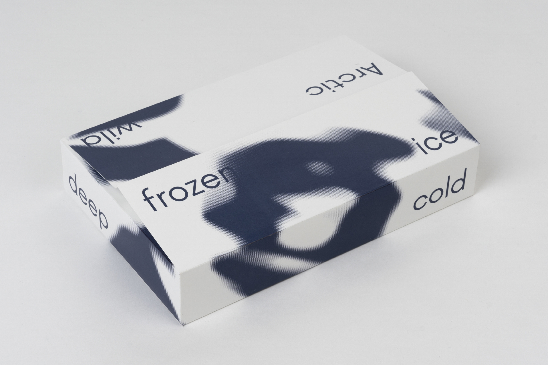
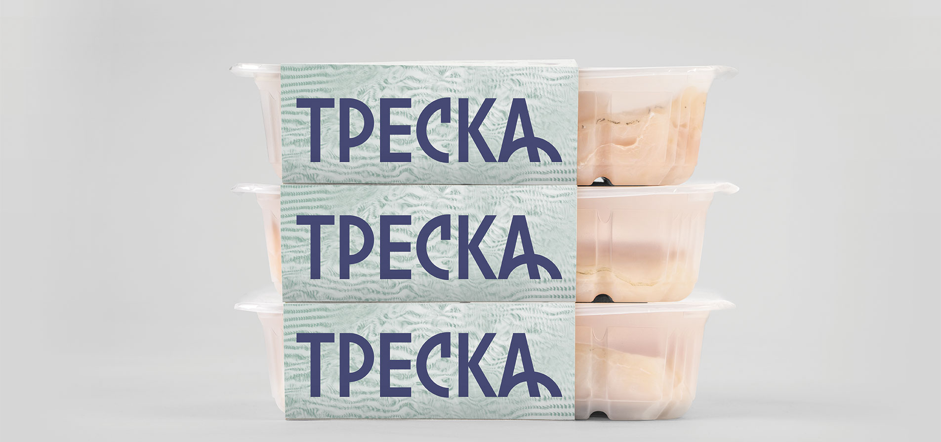
New sentences will automatically created by stacking the boxes on top of each other. Frozen wild fish, natural wild nord, frozen cold nord, natural wild north.